Recent posts with visuals

Showing posts with label good design. Show all posts

May 16, 2015

Great graphics: Pop Chart Lab

A popular Introduction to Psychology textbook challenges the reader to memorize a string of letters:

C I A N S A K G B F B I D O J

This is a difficult task for most people – the 15-letter string exceeds the magical number seven 1 rule for information processing. However, when shown the following string:

CIA NSA KGB FBI DOJ

most people are able to recall it perfectly after a very short period of time. The information is exactly the same; it is the relationship between the reader and the data that has changed. Visual design matters.

The human mind is capable of processing, very quickly, a large volume of complex information – if it is presented in the right way. Charles Joseph Minard's visualization of Napoleon's disastrous 1812 Russia campaign is a great example of proper presentation. Edward Tufte2 has called it ”the best statistical graph ever drawn”3.


The graphic communicates, simultaneously, the size of Napoleon’s invading force, its geographic position and direction of movement, and the recorded temperature. The brilliant visual design ensures that complex, interlinked variables are immediately and intuitively interpreted as a cohesive whole.

Great graphic design does not have to be limited to serious topics – in addition to being informative, it can be amusing, beautiful, decorative, irreverent, witty – ideally, all of the above. Pop Chart Lab, a design collaborative, has produced some of my favorite examples of exactly this kind of graphic design.

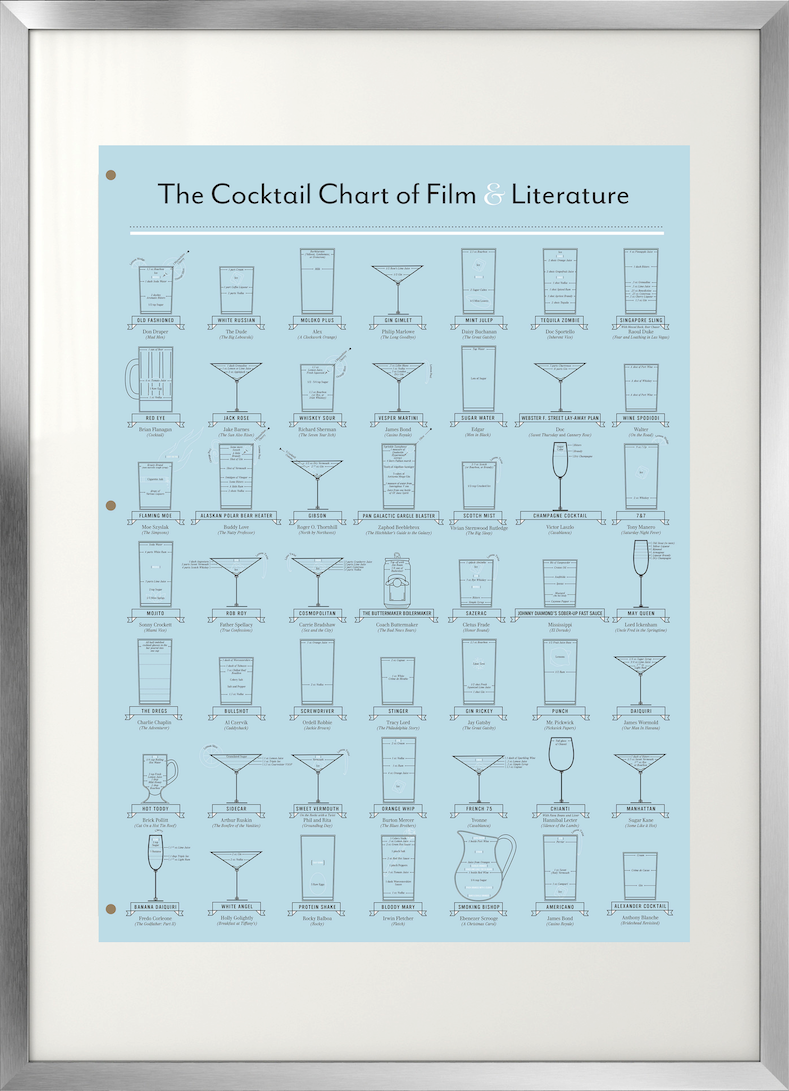
For the literary connoisseur with a pop-culture streak, Pop Chart Lab offers The Cocktail Chart of Film & Literature, featuring classics such as the whiskey sour and the cosmopolitan, as well as the more recent additions to the blended beverage repertoire.


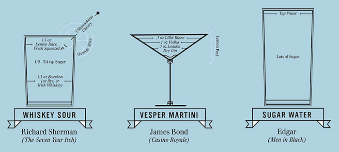
The design is clean, almost stark, with limited colors and streamlined graphics. At the same time, the visuals convey a plethora of information – the name of the featured drink, its native novel or film, the character imbibing the concoction, ingredients and their measures, the appropriate serving glass and even the recommended garnish.

The overall design is a stylized film script, the abstracted stack of pages in ”double blue” ( the color-code for the final script) held together by the three brass split pins. A script is the intermediate phase in the metamorphosis of a novel into film – a toast to all the great cocktails immortalized on the Silver Screen.


For those interested in all things typographical, Pop Chart Lab has devised the Alphabet of Typography.

Colorful enough to suit a child's room - the visual cleverly features the four typographical inks (magenta, cyan, yellow and black) - it is sophisticated enough to grace the home of a font-obsessed adult.


For the architecture aficionado, Splendid Structure of New York City offers a virtual tour of the city’s most significant landmarks.

Rendered in beautiful detail, the blueprint design perfectly complements the subject matter. The various buildings are immediately recognizable; each one is shown to scale relative to its neighbors, and indicates its street address, height, date of construction, architectural style and location in the city.


Design a walking tour that illustrates the changing façade of New York over time, focus on a favorite style, or concentrate on a particular neighborhood - all with the assistance of a single page. Landmarks of world renown share the visual real estate with important but more obscure structures, helping to avoid the bane of the curious traveler - getting home after a trip and realizing that you were within walking distance of a hidden treasure and did not know it.

As a decorative element, posters often suffer from an unfavorable perception of immaturity; an object best reserved for college dorm rooms. This is both unfair and impractical - not everyone can afford original art, even from a lesser-know artist. More importantly, a beautiful poster is art in its own right. The key to a fabulous poster presentation lies, unsurprisingly, in how the poster is framed - you need to create the right context for the viewer. Choose a quality frame with a wide mat - this immediately draws the eye to the artwork and creates a lot of negative space, elevating and enhancing the visual experience.

Custom frames can be extremely expensive - for the graphics sold by Pop Chart Lab, a custom frame can easily cost several hundred dollars. This is where Ikea provides a beautiful and affordable solution. The Ribba series offers a frame in a 19¾ x 27½ inch (50x70cm) size, available in a range of colors and finishes. The frame includes a mat, and is perfect for framing an 18x24 poster. The local framing shop should be willing to cut the enclosed mat to the right size for your chosen graphic (mine did it for free), or order a custom mat in a contrasting or complementary color, creating a bespoke look for the fraction of the price.

For the Splendid Structure of New York City, I suggest the Ribba frame in glossy grey. The neutral color anchors the graphics and enhances the blueprint look.


For the Alphabet of Typography, the Ribba frame in glossy red echos the graphic's bursts of primary color. The bold color choice is also in line with the subject matter - a well-designed font should grab your attention.


For The Cocktail Chart of Film & Literature, the brushed aluminum Ribba frame subtly references the finish of a cocktail shaker. Alternatively, a white frame provides a clean and modern look.


To forestall any potential frustration and disappointment, it is worth mentioning that Ikea's product selection varies by country. If your preferred frame color is not available, purchase the aluminum frame (available in most markets) and paint it with an enamel spray paint in the desired color.

As a small design bonus, Pop Chart Lab has created the (possibly) only greeting card you would ever need (click image to enlarge).


Suitable for all occasions, it offers a total of 276 different felicitations in a single card. I find especially thoughtful (and amusing) the inclusion of less positive sentiments.


Interested in the minute details of great visual design? Through June 3rd, 2015, the Ladislav Sutnar: Visual Design in Action - Facsimile Edition project is looking for funding on Kickstarter. Sutnar is one of the lost masters of graphic design, a pioneer of data visualization, the man responsible for the now ubiquitous parenthesis framing the area codes in US phone numbers. 5


1 Miller, G. A. ”The magical number seven, plus or minus two: Some limits on our capacity for processing information.” Psychological Review 63(1956): 81–97.
2 Edward Tufte is a guru of visual design, a staunch critic of PowerPoint charts (the use of PowerPoint format may be inadvertently responsible for the Space Shuttle Columbia explosion) and a great proponent of graphics that are both useful and beautiful.
3 Cookson, Clive. ”Edward Tufte” FT Magazine 26 Jul. 2013
4 Translation of text:
Figurative Map of the successive losses in men of the French Army in the Russian campaign 1812-1813.
Drawn by Mr. Minard, Inspector General of Bridges and Roads in retirement. Paris, 20 November 1869.
The numbers of men present are represented by the widths of the colored zones in a rate of one millimeter for ten thousand men; these are also written beside the zones. Red designates men moving into Russia, black those on retreat.
The informations used for drawing the map were taken from the works of Messrs. Chiers, de Ségur, de Fezensac, de Chambray and the unpublished diary of Jacob, pharmacist of the Army since 28 October.
In order to facilitate the judgement of the eye regarding the diminution of the army, I supposed that the troops under Prince Jèrôme and under Marshal Davoust, who were sent to Minsk and Mobilow and who rejoined near Orscha and Witebsk, had always marched with the army.
5 Stinson, Liz. ”Master designer who gave the area code its parentheses.” Wired 6 May 2015

April 3, 2015

Beautiful books & buttered eggs

     "You look a little worried, Bunter," said his lordship kindly to his manservant. "Is there anything I can do?"
     The valet’s face brightened as he released his employer’s grey trousers from the press.
     "Perhaps your lordship could be so good as to think," he said hopefully, "of a word in seven letters with S in the middle, meaning two."
     "Also," suggested Lord Peter thoughtlessly.
     "I beg your lordship’s pardon. T-w-o. And seven letters."
     "Nonsense!" said Lord Peter. "How about that bath?"
     "It should be just about ready, my lord."
     Lord Peter Wimsey swung his mauve silk legs lightly over the edge of the bed and stretched appreciatively. It was a beautiful June that year. Through the open door he saw the delicate coils of steam wreathing across a shaft of yellow sunlight. Every step he took into the bathroom was a conscious act of enjoyment. In the husky light tenor he carolled a few bars of ‘Maman, dites-moi.’ Then a thought struck him, and he turned back.
     "Bunter!"
     "My lord?"
     "No bacon this morning. Quite the wrong smell."
     "I was thinking of buttered eggs, my lord."
     "Excellent. Like primroses. The Beaconsfield touch," said his lordship approvingly.

~ Dorothy L. Sayers, Lord Peter Views the Body

      Upon such occasions poor Mr. Woodhouse's feelings were in sad warfare. He loved to have the cloth laid, because it had been the fashion of his youth, but his conviction of suppers being very unwholesome made him rather sorry to see any thing put on it; and while his hospitality would have welcomed his visitors to every thing, his care for their health made him grieve that they would eat.
      Such another small basin of thin gruel as his own was all that he could, with thorough self-approbation, recommend; though he might constrain himself, while the ladies were comfortably clearing the nicer things, to say:
     "Mrs. Bates, let me propose your venturing on one of these eggs. An egg boiled very soft is not unwholesome. Serle understands boiling an egg better than any body. I would not recommend an egg boiled by any body else; but you need not be afraid, they are very small, you see - one of our small eggs will not hurt you. Miss Bates, let Emma help you to a little bit of tart - a very little bit. Ours are all apple-tarts. You need not be afraid of unwholesome preserves here. I do not advise the custard. Mrs. Goddard, what say you to half a glass of wine? A small half-glass, put into a tumbler of water? I do not think it could disagree with you."
      Emma allowed her father to talk - but supplied her visitors in a much more satisfactory style, and on the present evening had particular pleasure in sending them away happy.

~ Jane Austen, Emma

If cooking is more appealing than reading, click here to go directly to the recipes.
A well-written book and a delicious meal have much in common. The reader and the diner both experience intense pleasure, simultaneously relishing the moment and eagerly awaiting to see what will come next. The joy outlasts the event, continuing in memory, discussion and anticipation of a return, even though it is often impossible to recreate that initial sense of discovery and wonder. I always feel a pang of envy when recommending a great book to a friend - they will have the joy of reading it for the first time! A beautiful book cover, like a carefully plated dish, elevates the experience by engaging our senses.

Several years ago, Coralie Bickford-Smith designed new covers for literary classics from Penguin Books. Bound in broadcloth, the books immediately create a tactile connection. The embossed designs add a second textural layer - running your fingers over the imprinted cloth creates a immediate sense of satisfaction. The substantial tomes harken back to a time when a book was more than a temporary possession; it was something to be kept and cherished for many years.

The bright graphics feel incredibly modern and at the same time offer a perfect compliment to the venerable contents. The cover for Emma features the eponymous Regency chair; the color is evocative of the early 19th century cerulean blue, a greenish-blue tint that was the precursor to the Victorian sky-blue shade of the same name.

© Penguin Books Drawing room chairs. 1826. NYPL Digital Collection

The color was popular in both fashion and home decor. The desired hue was achieved with a copper-cobalt dye pigment; as the copper oxidized, the fabric would take on a greenish tint.
The Repository of Arts, Literature, Commerce, Manufactures, Fashions, and Politics: No. XX. England, London, August 1810. LACMA Collections Online Source unknown
A quick side note: The fabric sample card on the left was included in the August 1810 issue of the Repository of arts, literature, commerce, manufactures, fashions, and politics, colloquially known as Ackermann's Repository, or, simply, Ackerman's. This publication was the Vogue of Jane Austen's time, setting the trends for architecture, fashion and literature. It would be fabulous if modern shelter magazines included fabric samples!

Ms. Bickford-Smith's designs for Austen's other works continue the period color scheme. The graphics feel inspired by fashionable Regency colors such as evening primrose (a deep, rich yellow) and coquelicot (a red so vibrant it was not permissible for well-bred ladies to wear it except in trimmings or accessories).
© Juniper Books LLC

Ms. Bickford-Smith's clever covers are not limited to period romances. The dark and moody design for Bram Stocker's Dracula features garlic scapes and flowers, a sly allusion to the antagonist's well-known allium allergy. The Hound of the Baskervilles cover is a seemingly innocuous collage of moth specimens; hidden in plain sight is a death's-head moth with its sinister skull-like markings - the friendly amateur entomologist who is concealing dark secrets.

© Penguin Books © Juniper Books LLC


In 2012, Open Road Media released new Kindle editions of the complete detective works of Dorothy L. Sayers, proving that an e-book can be just as charming as a leather-bound tome.
Cover art and design by Katrina Damkoehler
Between 1923 and 1937, Dorothy L. Sayers published a series of detective novels and short stories featuring the aristocratic sleuth Lord Peter Death Bredon Wimsey. Sayers herself led an extraordinary life - one of the first women to matriculate at Oxford University, she was a poet, playwright, translator and dedicated Christian scholar. Her life's work was the translation of Dante's Divine Comedy (unfinished at her death); her fame came from writing detective fiction.

Sayers' personal life reads like a great story - tempestuous affairs with writers and artists; an unexpected pregnancy, the illegitimate child left with relatives to be raised under an assumed parentage; an eventual happy marriage and, at the reading of her will, a posthumous revelation that her nephew was really her son (and sole heir). Sayers incorporated some details of her personal life into the Wimsey stories - a woman's unhappy affair becomes a plot thread that weaves through seven novels. This co-mingling of life and art flowed in both directions - although Sayers abandoned her last Lord Peter novel unfinished on the eve of World War II, she referred to him as a "permanent resident in the house of her mind" and said she found herself "bringing all her actions and opinions to the bar of his silent criticism"1.

Ms. Damkoehler's covers for the Lord Peter books perfectly capture the many aspects of the man himself in illuminating, exquisite detail. Lord Peter is a scholar, a dandy, a collector of fine wines and rare editions, a brilliant detective and a cosmopolitan man about town. His monocle is more than an distinguishing affectation - it is both a tool of the detective trade and a disguise which his lordship uses to hide his emotions. The witty use of garments gives clues as to the novel's when and where - linen suit for a summer at a seaside bathing resort; red tartan jacket and an argyle sweater for Scotland; a fur-trimmed coat for a winter drive through the Fenlands; hunting tweeds for a shooting party in Yorkshire in October. The designs make it clear that our hero is, along with other quests crucial to the plot, attempting to achieve sartorial splendor.
                                                                                                                                                                                         Click here to see larger images

Lord Peter is a gourmet with an unrivaled palate, but not a snob. He demands the best on his plate, be it perdrix aux choux or boiled peas - it does not have to be complicated, although it does have to be of the best quality and delicious. As his lordship himself put it: "I have never regretted Paradise Lost since I discovered that it contained no eggs-and-bacon.”2 His interest in food is so profound and self-evident in the novels that an entire book has been published on the subject. Sadly, it was missing the delicious-sounding buttered eggs. I have attempted to rectify this omission; you can judge the results for yourself.

Bunter's buttered eggs
This makes the most tender, creamiest scrambled eggs I have ever eaten, without any milk or cream.
It is important to use a non-stick pan, preferably one with a heavy bottom.

Per person:
  • 2 eggs
  • 2-3 teaspoons butter
  • Salt and pepper to taste
Put the butter and eggs into a cold pan. Place the pan on the lowest heat possible and start stirring. The eggs and the butter will first be broken, then form a homogenous mass.

As the eggs heat, they will start forming soft curds on the bottom of the pan. Stir the cooked egg up to the surface to ensure gentle, even cooking. Once the spatula leaves a clean mark on the bottom of the pan, sprinkle the eggs with a pinch of salt. For the first few minutes it will seem as if nothing is happening - keep stirring and resist the temptation to increase the heat!

If the egg curds are setting too quickly, remove the pan from heat for about 30 seconds and stir well before returning to the stove.
Cook, stirring continuously, until the eggs reach desired consistency, around 3 minutes. Season to taste with freshly ground pepper and serve.

Serle's boiled eggs
Adapted from The Breakfast Book, an excellent addition to any cookbook shelf. The plate tip is from the chef extraordinaire Heston Blumenthal.

My perfect boiled egg has a well-set white and a warm, creamy yolk. The simple task of cooking a soft-boiled egg is complicated by fact that the albumen (white) has a higher setting temperature than the yolk. To solve this challenge what follows is not so much a recipe as a process description.
Bring a pot of water to a boil3. Exact amount of water will depend on the dimensions of the pot - the egg should be covered by at least an inch of water; it is better to use a larger pot if making more than one egg - the larger the water volume, the smaller the drop in water temperature when the eggs are added.

When the water comes to a boil,lower the heat to a simmer and place a small plate in the bottom of the pot - this will insulate the egg from direct heat. Using a spoon, gently lower the desired number of eggs into the pot. After 7 minutes (exact time depends on egg size and your personal preference), the white should be set and the yolk silky. If the egg is over or under for your taste, adjust the cooking time accordingly. Rinse under cold water to stop the cooking and serve, preferably with some buttered toast soldiers.


If you are interested in learning more about the process of designing a book jacket, Wired magazine published an interview with Peter Mendelsund, the artist behind the cheery yellow cover for The Girl With the Dragon Tattoo.


1 Dorothy L. Sayers & Jill Patton Walsh, Thrones, Dominations, Author's Note.
2 Dorothy L. Sayers, Busman's Honeymoon, Chapter IV: Household Gods.
3 This is a perfect time to use an electric kettle, if you have one. It will be both much faster and more energy efficient than boiling the water on the stove.